Tuesday, October 13, 2009
My logo


Brochure design
Client : Landscape architects
USP : Backyard escapes
Type : Brochure design and production


USP : Backyard escapes
Type : Brochure design and production


Production pieces
 Client : Smart
USP : Smart for 2 coupe
Tagline : If you want to feel it you've got to drive it
Type : 2 page magazine spread
 Client : Caldier
USP : Really clear glasses
Tagline : Your choice is absolutely clear
Type : 1 page magazine print ad
 This is a typeface that i designed for an assignment.
More roughs
 Client : Pizza Hut
USP : More topping on their new 16" pizza


 Client : Woolsworth Canned Tuna
USP : Really fresh tuna
Creative roughs
Here are some roughs I did in Creative Practice and skills. Client : Giant Mountain Bike
USP : Air filled oil sprung shock absorbers
Tagline : Make every ride the ride of your life

 Client : Squeeze and Grind
USP : 3 new locations in the city
Tagline : Enjoy the same great coffee and juice you enjoyed at the airport
 Client : Reflex Paper
USP : 100% recycled paper, strong and durable
Tagline : Use less trees
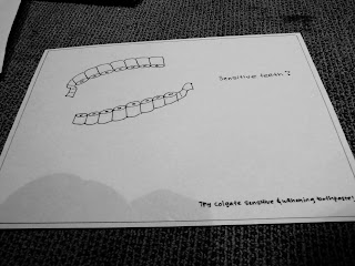 Client : Colgate
USP : Sensitive and whitening toothpaste
Tagline : Sensitive teeth?
 Client : Giant Mountain Bike
USP : Air filled oil sprung shock absorbers
Tagline : Make every ride the ride of your life

 Client : Squeeze and Grind
USP : 3 new locations in the city
Tagline : Enjoy the same great coffee and juice you enjoyed at the airport
 Client : Reflex Paper
USP : 100% recycled paper, strong and durable
Tagline : Use less trees
 Client : Colgate
USP : Sensitive and whitening toothpaste
Tagline : Sensitive teeth?


Another interest
I am also kinda into photography. I love taking photos of almost anything. :) These are some of the images i took at the 'watch me train' sessions we attended during our assignment on Assistance Dogs Australia.


Postcard
This is a set of postcards i did for The Australian Red Cross Society. The postcards were presented in a semi-transparent bag with red transparent wrapping paper inside as if to show a blood pack. There was also a blood tube stuffed with some red paper at the bottom of the pack.


The objective of these postcards is to show the low blood supply of the Australian Red Cross Society. The images are layered as if they were wrapped with plastic.


The objective of these postcards is to show the low blood supply of the Australian Red Cross Society. The images are layered as if they were wrapped with plastic.

Typography posters


These are done in Shelley's class last year where we were supposed to use typography to create a poster.
My mission statement.
Who am I?
Im Donovan Goh, a 21 year old RMIT student and part time waiter.
Where am I located?
I am from Kuala Lumpur, Malaysia and I am currently located in Melbourne, Australia where i am doing my degree.
What do i do?
Having done advertising for almost 3 years in college and uni, and also by possessing an outgoing personality, i am easily attracted to all the advertising around me. I am inspired by creative ideas and artwork and I also think of different approaches to what i see.
e portfolio. :)
To start things of, this is a blog of some of what i have done for the past few years in college and uni.
Note. Some stuff here are as lame as this note. :)
Note. Some stuff here are as lame as this note. :)
Subscribe to:
Posts (Atom)