Tuesday, October 13, 2009
My logo


Brochure design
Client : Landscape architects
USP : Backyard escapes
Type : Brochure design and production


USP : Backyard escapes
Type : Brochure design and production


Production pieces
 Client : Smart
USP : Smart for 2 coupe
Tagline : If you want to feel it you've got to drive it
Type : 2 page magazine spread
 Client : Caldier
USP : Really clear glasses
Tagline : Your choice is absolutely clear
Type : 1 page magazine print ad
 This is a typeface that i designed for an assignment.
More roughs
 Client : Pizza Hut
USP : More topping on their new 16" pizza


 Client : Woolsworth Canned Tuna
USP : Really fresh tuna
Creative roughs
Here are some roughs I did in Creative Practice and skills. Client : Giant Mountain Bike
USP : Air filled oil sprung shock absorbers
Tagline : Make every ride the ride of your life

 Client : Squeeze and Grind
USP : 3 new locations in the city
Tagline : Enjoy the same great coffee and juice you enjoyed at the airport
 Client : Reflex Paper
USP : 100% recycled paper, strong and durable
Tagline : Use less trees
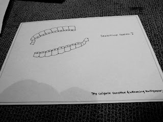 Client : Colgate
USP : Sensitive and whitening toothpaste
Tagline : Sensitive teeth?
 Client : Giant Mountain Bike
USP : Air filled oil sprung shock absorbers
Tagline : Make every ride the ride of your life

 Client : Squeeze and Grind
USP : 3 new locations in the city
Tagline : Enjoy the same great coffee and juice you enjoyed at the airport
 Client : Reflex Paper
USP : 100% recycled paper, strong and durable
Tagline : Use less trees
 Client : Colgate
USP : Sensitive and whitening toothpaste
Tagline : Sensitive teeth?


Subscribe to:
Posts (Atom)